
Project [Alight]
Introduction
Alight was the final major project for my Master degree to create an iPhone application which allows creative professionals to manage their ideas in locative manner. My responsibility was User Interface Design, and I approached this project from the perspective of User-centred design as well as attempting to apply the findings from my thesis to the process. Although the Master degree has completed, this project is stil on-going and the detail of the application will not be revealed here. Instead, this page will show some of my learnings.
Conceptualization
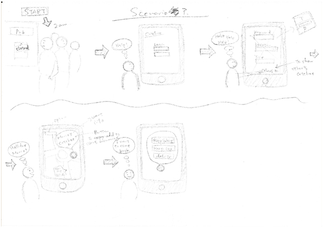
After the initial user survey, lots, lots, lots of brainstorming and deciding the target user, the first step was to analyse behaviour of users: which step should be replaced and enhanced by the novelty of digital media, and which step should NOT be retouched by any digital elements. Some user scenario were drawn and discussed in the team. The most difficult issue was how we could take balance between usability and technical limitation, which means providing accurate information to usability/technical colleague was vital. Drawing user scenario quickly by hands was very important task for me to hold a common understanding between team members, not to be twisted by personal interpretation.
Flowchart, wireframing and usability test
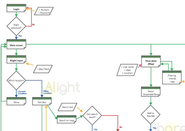
Based on the user scenario board, I created a basic flowchart of the application process and the first wireframe. These two documents were again passed to the other team members, and the usability test and technical research were done based on the flow. Although this worked quite well for the technical colleague, unfortunately it didn't for the usability. The problem was that this flowchart described only the functionality of the application, and didn't show any "information flow": what kind of information users can input/retrieve. As a result, I couldn't provide my colleague enough information to conduct a precise usability test, and it seemed that the test participants had difficulty understanding the context of this application.
More usability test and prototyping
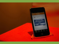
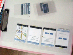
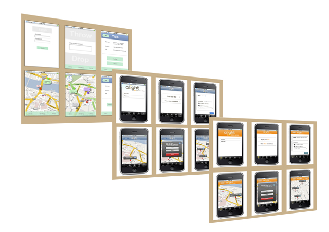
Based on the result of the first usability test, I improved the flowchart and the wireframe by including the information flow. Several more usability test including paper prototyping and in-situ test were conducted, and the project moved onto the final graphical interface design and prototyping. Since the technical specification ended up being very challenging, I also needed to do some HTML/CSS/Javascript coding by myself to simulate the application for the usability test. This final step was also quite challenging, as there was a lot of marked characteristic of mobile device, such as the size of the screen, usability of touch screen, accessiblity and design issues such as difficulty of defning terminology etc.
The most important fact this project taught me was that the importance of "packaging". It seems that designing user experience is not only about designing the functionality of the application, but also, literally, designing the "experience" for users including the information flow. And in order to let users enjoy the "experience", skills of story-telling seemed also important. Achieving all these task is extremely demanding when usability and technical issues were considered. That may be the reason why the tools such as sketch book, flowchart application, and talking to team members a lot are significant for UI/UX designer.
For the current situation of this project, please contact to maytone@bh.raindrop.jp